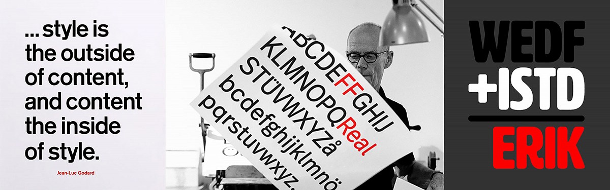
Typomania with Erik Spiekermann
We recently had the pleasure of attending a West of England Design Forum talk given by two big contenders in the world of Typography. Jonathan Doney, current chair of the International Society of Typographic Designers and Erik Spiekermann, an internationally renowned typographer.
Details
- by
We recently had the pleasure of attending a West of England Design Forum talk given by two big contenders in the world of Typography. Jonathan Doney, current chair of the International Society of Typographic Designers and Erik Spiekermann, an internationally renowned typographer.
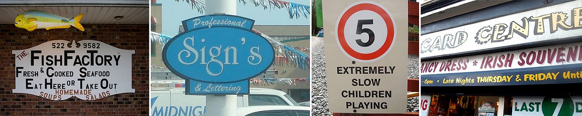
Jonathan introduces himself as a self proclaimed Typomaniac and takes pleasure in showing us his hobby – spotting terrible typography out in the wild; on the streets he walks and the places he visits. He tells us there are several different stages of Typomania and if we can spot what’s wrong with the examples on screen we are increasingly likely to suffer from the same affliction.
Erik Spiekermann is a German art historian, type designer and printer with a career spanning 50 years. As soon as he starts talking you realise he’s a straight talking, foul mouthed, no nonsense kind of man with bags of enthusiasm.
Erik speaks about how he works in whatever medium he needs to in order to fulfill the brief but his career has spanned decades, from using a pencil and paper to design type, to using computers to do everything.
He describes his own studio and how he has (unintentionally) collected several large printing presses and cases of type just because people assumed he would want them. It’s given him a renewed passion for letterpress and he shows us many of the posters he has created with his own presses.
He’s fascinated by how in many other design mediums we (as designers) strive for perfection but with the restrictions of letterpress and the limited amount of type available it forces us to be more flexible. Due to the popularity of computers much of the original metal type has long been melted down for other uses so if you have a typeset that doesn’t contain enough E’s or S’s you need to combine typesets from different fonts or just miss the letter out entirely. Something quite unintentional but often clever can emerge.
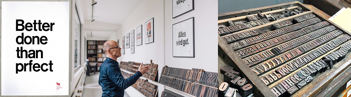
Even when working with restrictions there is a clear difference between good and bad typography.
Erik speaks about the importance of his typographic work in the reunification of Berlin and how it’s still one of his proudest moments. It played a part in bringing the two halves of a once divided transport system together in a cohesive way. The designs he creates are simple, legible but have their own functional beauty.
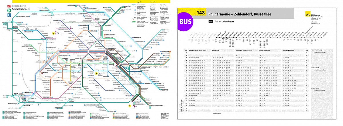
He displays a copy of a subway map and explains that nobody takes any notice of this stuff but it’s been designed by someone. Someone who’s thinking about how the viewer uses it and the best way for the information to be presented as efficiently as possible.
Good typography is a thing we don’t think about on a daily basis, especially out in the wild. We see it everywhere in print, on signage, websites, posters, way finding and informative literature. Remember, good typography rarely gets noticed, but bad typography always does.
Don’t take good typography for granted, call to have a chat with us about anything from your next project to Erik Spiekermann, we are always be happy to hear from you.
Written by Kubiak’s Illustrator and Web Designer Emily
If you want to find out more about Jonathan and the ISTD visit http://www.istd.org.uk/
Erik can be found on his blog http://spiekermann.com/en/ and Twitter @espiekermann