The importance of typography
You may think a company’s images are solely responsible for brand recognition, but there’s a subtler, more stealthy device at play – typography.
Typography has always played an important role in a brand’s identity. However unlike a brand’s imagery, which unabashedly grabs your attention, typography quietly works its way into the audience’s subconscious, creating a general ‘feeling’ about the brand that shapes its relationship with its target market.
Not only does typography help build brand recognition, it also plays a huge role in establishing a company’s tone of voice and personality, which is incredibly important to get right if you want to be perceived a certain way. Are you loud, young and fun…or subtle, sophisticated and refined? When it’s done well, typography can effectively and powerfully shape a company’s identity.
Let’s have a look at how typography is used by some of the big brands…
Details
- by
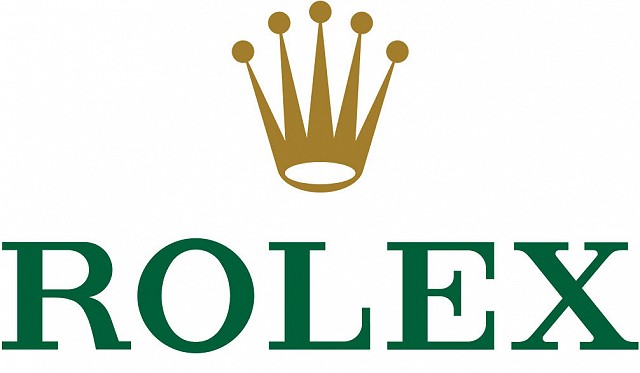
Rolex
This luxury watch brand’s use of typography has remained mostly unchanged since 1952, which is testament to the quality of its design. It oozes class and elegance, yet also strength, which helps instill trust in the audience. Paired with its timeless crown icon, the two work together to depict a highly desirable and trustworthy brand.

Barclays
When it comes to banks, you want the brand to instill trust and confidence in its audience. Barclays’ use of typography does just that. Using strong, bold and impactful lettering, the typography works with the eagle icon to create a powerful brand that is easily recognisable. Its subtle use of italics suggests a forward-thinking and modern company whilst the eagle communicates heritage and authority.
![]()
IBM
Designed by Paul Rand in 1972, IBM’s brand is purely typographic. Still going strong, the typography is bold, confident and instantly recognisable. The use of the slab serif nods to the company’s technological core, giving the brand a very solid and grounded feel. The iconic use of lines within the letters are said to represent speed and dynamism, which is perfect for the service it represents.
![]()
Fedex
As with IBM, Fedex’s brand is purely typographic but cleverly uses negative space to create the arrow between the ‘e’ and the ‘x’. The arrow not only hints at the company’s distribution services but also suggests a forward-thinking and efficient brand. This is highlighted further by the confident and modern typeface, which with its bold style exudes trust and quality.
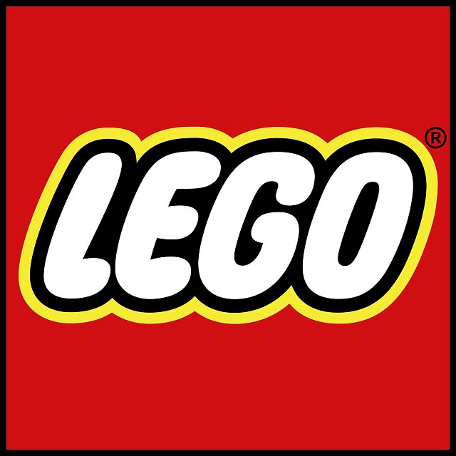
Lego
Lego’s use of soft, rounded and bubbly typography creates an approachable and fun brand, which is perfect for its target market. Imaginative, creative and inherently playful, the typeface is recognisable and has become somewhat iconic. Other than a few tweaks here and there, it’s stood the test of time, giving it an enduring quality that conveys trust, heritage and familiarity.
When considering typography in branding, it’s important to think about where it’ll be used, as different mediums will impact it in various ways. For example, Apple updated their typography to work on smaller devices and Facebook recently changed their logo to be more mobile-friendly. Making sure the style works as well on screen as it does off is incredibly important to the design process.
There really is so much to explore, and developing the look and feel of a brand’s typography is an extremely creative and fascinating process. So whatever happens, make sure you have fun with it. If you think your brand needs a typeface refresh or would like to develop something from scratch, get in touch.