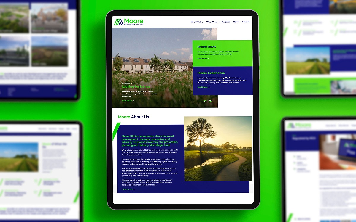

Kubiak were approached by David Moore, a Chartered Surveyor with sixteen years of experience in the property advisory and development industry, to help him launch his new development management company.
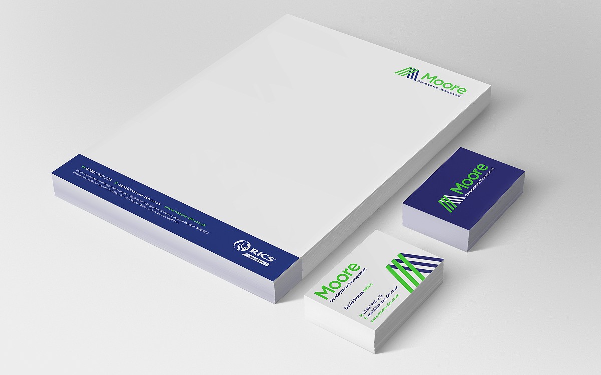
Our initial consultation began with brainstorming brand names for the new company. Utilising David’s surname, the name Moore Development Management was agreed upon. The next stage was for us to create the new brand logo for the business. David wanted this to represent his forward-thinking approach and to stand out in the marketplace. To achieve this, we created a bright, vibrant, contemporary colour palette, complemented by a modern sans-serif typeface and logo graphic. The brand graphic represented the M in Moore, creating a striking and iconic symbol that can be broken down into its separate graphical elements to become new infographics from single diagonal lines to directional arrows.


Once the brand was set, Kubiak designed and built the new website and created a full set of stationery for Moore Development Management. To ensure the vibrancy of the brand was consistent throughout the printed stationery, a fluorescent Pantone green was used. This made his new stationery look superb and sure to grab the attention of anyone David hand’s a business card to.